7 Things Churches Get Wrong With Their Online Presence
By Pastor Eli
Most of what churches get wrong online isn't a design problem. It's that nobody in the church has ever looked at what a stranger sees.
I keep a database of about thirty-five thousand churches, and I spend most of my week looking at their websites, their Google listings, and their Facebook pages. I've graded 147 church websites by hand, and this year I've built new sites for dozens of churches. The same seven mistakes keep coming up. Big churches make them. Small churches make them. Churches with good websites make most of them.
None of these costs anything to find, and most cost nothing to fix. The first one takes two minutes with your phone.
Read all seven.
Tell me who you are and the whole article opens right here. It’s free, and you’ll only be asked once. Every article like this one opens for you after that.
I won’t sell or share your information.
1. You've never looked at what Google says about you
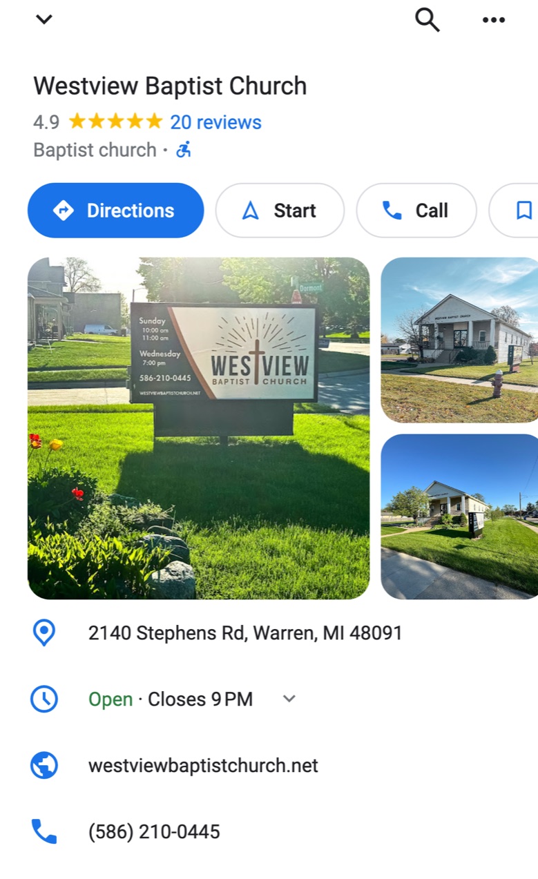
For a lot of people, your website isn't the first thing they see. When someone types your church's name or "churches near me" into their phone, Google answers with a box before they ever reach your site: your name, a pin on the map, your hours, some photos, a star rating. Plenty of people never tap through. They read the box, make up their mind, and either drive over or keep scrolling.
Our church's Google listing on a phone. This is what people see before they ever reach a website.
That box is your Google Business Profile. In my experience it's the most neglected thing a church has online, and the reason is simple: nobody in the building ever sees it. You don't search for your own church. You already know where it is.
Here's what I find in those boxes:
Photos of other churches. Anyone can add photos to your listing. On one church's listing I counted six photos, and four of them were sanctuaries that weren't theirs: different pews, different paneling, a white A-frame hall. My best guess is that people at funerals somewhere else tagged the wrong church. A family planning their first visit has no way of knowing that.
Somebody else's name. Buildings change hands. One church I worked with this fall still shows up on Google Maps under the name of the congregation that met in their building before them.
"Closed" on Sunday morning. If the hours on your listing are your office hours, Monday through Friday, then at 10:45 on a Sunday Google is telling people you're closed.
The last pastor. Reviews stay up for years. I once learned a church's previous pastor's name from their Google reviews before I'd found it anywhere else.
Nobody home. If your listing shows a link that says "Own this business?", nobody has claimed it. Anyone can suggest changes to it, and nobody from your church gets a say in which ones Google accepts.
The two-minute check
Do this on your phone, not your computer. That's where your visitors are.
Search your church's exact name and town.
Look at the box. Is the name right? The address? The phone number? Does the website link go to your current site?
Tap the hours. What does it say at the time your main service starts?
Tap the photos and scroll through every one. Would a newcomer recognize your front door from these?
Look for "Own this business?" If it's there, your listing is unclaimed.
Read every review, especially any that never got an answer. Then look your church up on Yelp and do the same.
How to fix it
Claim the listing at business.google.com using an account the church owns, not a volunteer's personal Gmail. (That last part matters more than it sounds. It's number seven on this list.) Then:
Set your hours to your service times. A church with a 10:30 service can list Sunday from 10 to noon, plus Wednesday evening if you meet then. Add special hours for Christmas Eve and Easter, when the most people are looking.
Upload ten or so photos of your own. The building from the parking lot, your sign, the door people should use, the room during a service, your people. Flag any photo that isn't your building.
Pick the most specific category. "Baptist church" or "Pentecostal church" tells Google more than "Church."
Get ahead of your reviews
Know what people have said about you. Read every review on Google and Yelp, and answer each one, the kind ones too. A sentence or two is plenty. A calm, gracious reply to a hard review tells a visitor more about your church than the review itself does.
Then don't wait for the bad one. Two five-star reviews and one angry one-star average out to 3.7 stars, and that number sits right next to your name. Add thirty honest reviews from members who love the church, and the same one-star barely moves you. So ask your whole congregation to write a review on Google. Mention it from the pulpit, put it in the bulletin, and make it easy: your Business Profile has an "Ask for reviews" link you can turn into a QR code.
Ask everyone, and ask for an honest review, not a five-star one. Google's rules don't allow asking only for positive reviews, and reviews that look orchestrated get taken down. Your people will be kind without being told to. Yelp is stricter. It asks businesses not to request reviews at all, and its software hides a lot of the ones that look requested. On Yelp, claim your page, keep it accurate, and answer what's already there.
That's the first one, and it's the one most churches get wrong first, because it's the one nobody looks at. The other six are about what happens once someone taps through to your website, and I'd guess at least two of them describe your church right now.
2. Your homepage is a bulletin board
When I graded those 147 church websites, I expected the bad ones to be the ones with old technology: no secure connection, not built for phones, a copyright date from years ago. That isn't what separated them. An out-of-date copyright year showed up on 15% of the good sites and 14% of the bad ones. Nearly all of them, good and bad, at least adjusted to fit a phone.
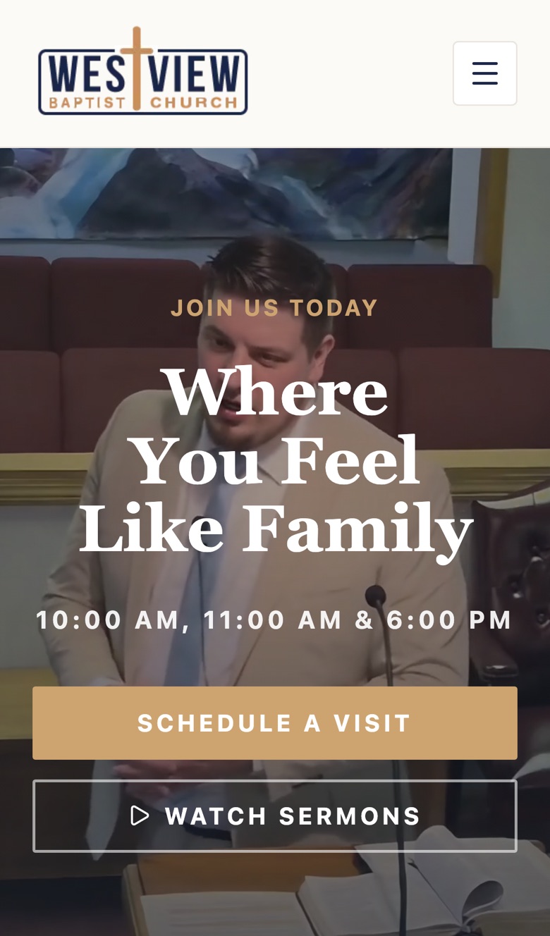
What separated them was the first screen. The good sites open with a real photograph across the whole screen and one sentence that says something, like "Jesus still changes lives" or "Welcome home." The service time and address sit right there or one scroll down, and there's one obvious next step, usually "Plan your visit."
Our church's homepage on a phone. A clip from a real service, one sentence, the service times, and a button to plan a visit. Everything else is one scroll down.
The bad sites open like the bulletin board in the fellowship hall. A verse-of-the-day widget. A calendar. Three announcements in three columns. A member login. "Welcome! Thank you for visiting our website." Small type, with everything given the same weight, so nothing gets read.
Every item on that bulletin board was put there by someone with a good reason, and that's exactly how it happens. But a visitor doesn't read your homepage. They glance at it. In that glance, a designed front page says "these people are expecting me." A bulletin board says "this is for members."
The fix: clear the first screen down to one real photo of your church, one sentence, your service time, your address, and one button. Move everything else one click deeper. Anyone who wants the calendar will find it.
3. A visitor can't answer three questions in ten seconds
Every first-time visitor has the same three questions. When is it? Where is it? What will it be like?
Pick up your phone, open your church's website, and start a timer. Can you find the Sunday service time in ten seconds without scrolling? Can you tap the address and have it open in Maps? Can you find out what people wear, where to park, which door to use, and what happens with your kids?
On a lot of church sites, the first answer is there somewhere, the second is in the footer in small gray type, and the third isn't anywhere.
The third question is the one that keeps people home. Nobody wants to walk into a room full of strangers not knowing whether to wear a tie or which door to use. A short "Plan your visit" page takes care of it. Say what time to arrive, where to park, which door to come in, what people wear, how long the service runs, what happens with children, and whether anyone will single them out. (The answer to that last one should be no.)
The fix: put your service time and a tappable address on the first screen of your homepage. Then write a plan-your-visit page with a real photo of the door you want visitors to use.
4. It's written for the people already inside
Read your website as if you'd never been to church. Here's some of what a newcomer runs into:
"Sunday School 9:45, Morning Worship 11:00." Is Sunday School for children? Do adults go? Am I supposed to come to both?
AWANA, VBS, WMU, RA's, "the annex," "Fellowship Hall." Every one of those means something to your members and nothing to a visitor.
"Click here for this week's bulletin," which opens a PDF too small to read on a phone.
A calendar of committee meetings, choir practice, and the deacons' meeting.
None of that is wrong. It's just written for members, and your members already know when church starts. The person who needs your website is the one who doesn't.
The fix: write for someone who has never set foot in a church. Spell out acronyms or leave them off. "Bible classes for every age, including adults" says more than "Sunday School." Turn the bulletin and the newsletter into ordinary pages that read well on a phone.
5. Something on it is dead
The copyright year at the bottom of the page doesn't matter much (see number two). Dead things near the top matter a great deal.
An "Upcoming Events" section where the newest event was last Easter.
A staff page with a pastor who left two years ago.
A "Watch Live" button at a church that stopped streaming. Someone taps it on Sunday morning and gets a video from 2021, or nothing.
A Facebook feed on the homepage that last posted in the spring.
A visitor doesn't think, "They forgot to update the website." They think, "I wonder if this church is still open."
The fix: go through every page once with a pen and delete anything with a date that's already passed. Don't put a "Watch Live" button on the site unless you stream every week. If you post sermons afterward, call the button "Recent sermons." From here on, set events up so they come off the site on their own the day after they happen. A good website can do that without anyone remembering to.
6. Nobody answers the door
Your website almost certainly has a contact form or an email address on it. So here's a question I'd like you to actually answer: where do those messages go?
More often than you'd think, nobody's sure. The form was set up years ago and sends to an address that belonged to a volunteer, a former secretary, or the pastor before last. Or it goes to an inbox somebody checks once a month. The mom who wrote "Do you have anything for my teenager?" on a Tuesday night and never heard back isn't coming on Sunday.
And a plain email address printed on a web page gets collected by spam robots. That's how a church inbox fills up with so much junk that the real messages get buried.
The fix: tonight, fill out your own contact form with a question a visitor might ask, using an email address you'll recognize. Watch whether anyone replies, and how long it takes. Then decide who answers those messages and how fast. Within a day is a good standard. If you'd like people to be able to reach someone on a Tuesday night, a chat box on your website that sends messages straight to somebody's phone is worth considering.
7. Somebody else holds the keys
Remember the Google listing from number one? This is the bigger version of that problem.
Your church's online presence depends on a handful of accounts: the domain name (yourchurch.org), the website host, the Google listing, the Facebook page, the YouTube channel, and the church email. At a lot of churches, every one of those was set up by one helpful person, using their personal email and their own credit card. That works fine until the person moves away, leaves the church, or passes away. Then the renewal notices go to an inbox nobody reads.
Here's some of what I've run into just this year:
A church whose domain had been suspended because a verification email from the company that registers it was never answered. Anyone who typed in the address from their roadside sign got a page from that company, not the church, and the church didn't seem to know.
A church whose old web address now shows pages in Thai about factory machinery. The registration lapsed and someone else bought it.
Plenty of churches whose only working home online is a Facebook page, which can be locked or lost along with the one person who runs it.
The fix: make a list of every account your church has online. Next to each one, write whose email it's under and who knows the password. Then move them all under one account the church owns. The best option is a Google Workspace account on your own domain, which most churches can get free through Google for Nonprofits. Give at least two people admin access to everything, and set the domain to renew automatically on a church card.
Where to start
If you haven't done the two-minute Google check from number one, do it today. Then do number six, because somebody may already be waiting on an answer.
If you want a quick read on how your website holds up, the free Church Website Score will grade it for you. And if you went down this list and kept thinking "that's us," I'd be glad to help. This is what I do every day.
Written by Pastor Eli, in hopes of being a help to your ministry.